Look-see is a long time in the making for me. It all started when I was 8 years old, on the day I was prescribed eyeglasses. That was the day I found out that not only had I been right about my vision sucking, I also have a genetic degenerative eye disease. The doctor explained that my vision would continue to decline, and eventually, I would go blind. There's no treatment and no way of preventing it. It was a lot to take in as an 8-year-old. Since then, my vision has gotten worse, and one side effect that they didn't mention is that the range of color I can see has also declined. Most people think of red-green color blindness when they think of color vision deficiency. There are actually multiple forms of color deficiency, and it's far more common than most people think.
Finding Inspiration
I obviously didn't realize as an 8-year old that I needed to do something about this. In fact, it would be over 20 years before I was inspired to create a system to make the internet more usable. My inspiration started while working with an incredibly talented team at a Boston-based startup. From the start, we were getting great traction. Unfortunately, as our web traffic increased, the people we left behind became more and more obvious. What started as a rare event turned into thousands of potential customers bouncing unexpectedly. It turns out that small problems at scale become big problems.
It was tough for us to pinpoint exactly why people were bouncing. There also weren't any tools that could give us the level of insight we wanted. So, we set out to create our own tool internally. Piece by piece, we created a system that could tell us where people were struggling. The system worked beautifully and quickly identified problem areas on our website. Unfortunately, it was never made publicly available for other companies to use. Such is the fate of most internal tools.
New projects, same problems
After a couple of years, I moved on to new challenges. I went on to help multiple large tech companies create products that served millions of users. With each new project, it became increasingly clear that no one else seems to have a good way of improving their UX predictably and really serving their user's needs. These companies took their UX seriously. Engineering teams were plugged into the UX design process and listening to users directly. There were meetings where everyone reviewed customer complaints and user research to refine and improve product road maps. We spent a ton of time focusing on improving the UX but we didn't seem to make much progress. something was missing. Data.
Despite all of the planning and product and UI design meetings, they lacked the data necessary to validate which changes would provide the most value. As a result, the products struggled to reach the performance metrics that were important to management. The teams would debate over which part of the design or user flow was the cause of their users bouncing. Since they didn't have the necessary data, they were left improving their UX blindly. They were reviewing the designs regularly, but they didn't measure them against anything. With no way to knowing if changes would actually impact the user experience, they would use vague metrics like returning visitors or the number of complaints and then conjure meaning out of the chaos. It wasn't very effective.
UX shouldn't be a guessing game.
I believe that creating great user experiences shouldn't be a guessing game. Nor should you rely on experts doing manual audits to keep track of all potential issues on a website. They might be experts, but they aren't machines. People simply don't do well with keeping track of tons of information or doing tedious work for long periods accurately. To make things worse results of manual UX audits are often heavily biased based on the skillset and areas of focus of the people performing the audit.
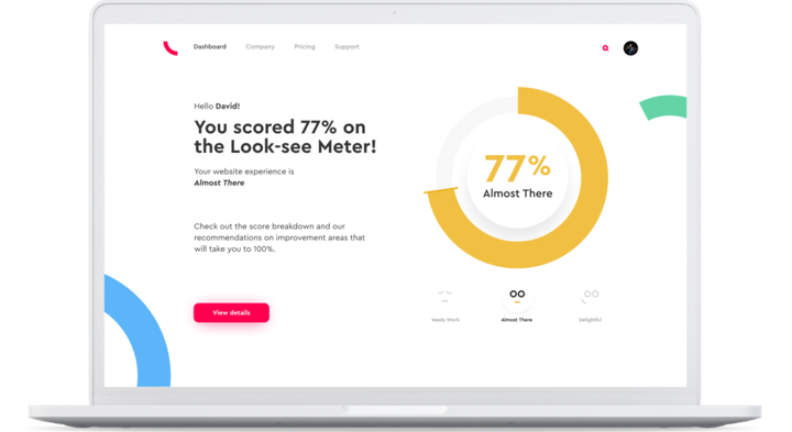
Instead, the UX audit process should be automated so that UX experts can focus on making the user experience as delightful as possible. Look-see helps teams find UX issues and even offers recommendations on how to make improvements that even help stakeholders understand why various improvements are important. UX is hard, it doesn't also have to be time-consuming and tedious.
