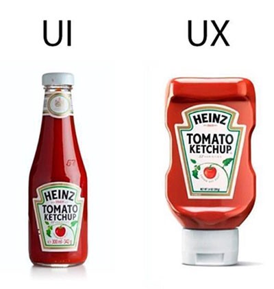
User experience has become a trendy term that’s regularly tossed around in design and product circles. But as a beginner, it’s not necessarily clear what user experience is. According to Merriam Webster, UX is defined as
"The overall experience of a person using a product such as a website or computer application, especially in terms of how easy or pleasing it is to use."
That really clears it up. What does that mean in terms of websites and SaaS products? UX seems ambiguous because it’s a cross-section of various areas of expertise. UX impacts everything from design and front-end development to market/user research. How you use color matters just as much as the speed that everything loads. In the next 5 sections, I’ll review the various areas that impact user experiences.

Color Theory
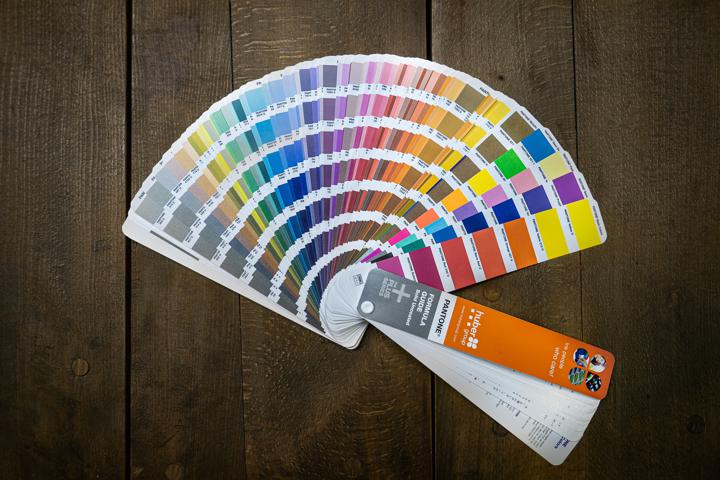
Most users will decide in less than half a second if they like the design of your website based on color alone. So, it's important that you choose your color palette carefully. Ideally, you use colors with enough contrast to accommodate those with color vision deficiency while using your color in a balanced way that looks amazing in both light and dark mode. If you’re just getting started, that seems like a lot, and it is. It’s worth taking the time to get right. The only alternative is to suffer a high bounce rate, and nobody wants that.

Typography
Most users don’t think about typography, yet it can profoundly impact your users' perception of your brand. When you use too few or too many typefaces, your experience can be uncomfortable to interact with. Too many typefaces make your design seem chaotic, and too few typefaces can make your design seem flat. When users see either of these, they tend to think of the brand as less professional and less trustworthy. So how many typefaces is the right amount? At Look-see, we recommend using only two typefaces, one for headings and the other for regular text. Doing this helps make the text easier to navigate as users skim through content.

Security and Interactivity
Once you're done making everything look good, you still have to make sure it’s usable. Often product teams overlook the importance of security and system feedback to the user. Nothing will destroy trust more than a website that doesn’t use SSL or provide useful system feedback. When errors happen, users want to be informed of what went wrong how to fix it. That doesn’t mean users don’t want to see affirmation that something worked correctly. User’s want to be informed at all times. If nothing happens when they press a button, they are more likely to assume that something is wrong, even if everything worked correctly. The last thing you want is your users thinking your service isn’t delivering the value they expected. Each moment of distrust will be remembered when they think about using your brand in the future.
Visuals
You shouldn't overlook the images and videos you use. These days, people consume most content through video and memes. Well-placed videos and images that are styled consistently with your brand are crucial. Studies have found that users are more likely to watch a 15-second video instead of reading. When your images don’t align with your brand, you are sending mixed messages to your users. Make sure you are using imagery and video that sends the right message so that customers feel comfortable paying for your service.

Information Architecture
HTML and content structure determine how accessible and usable your website is. Often, people will accept HTML that is hacked together as long as it looks the way they want. Unfortunately, when you treat HTML as a means to an end, you also alienate many people who use screen readers. They don’t ever see all the pretty stuff you put together, but they do witness the mess that is your HTML.
That’s not all there is to information architecture. How you use margins(hopefully rarely) and how you structure your navigation also matter. According to Hick’s law, too many choices make it harder to make a decision. By taking a minimalist approach to how your information is accessed, you are investing in the usability and accessibility of your website.
Wrapping up
UX encompasses every area of your product. By getting each area mostly right, you’ll find that customers think more highly of your service. Those same users would be willing to pay extra for a pleasant user experience in many cases.
