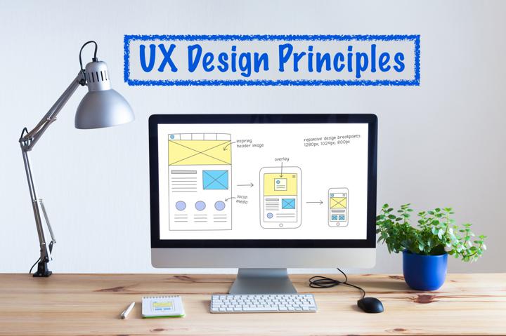
A UX audit is all about finding ways to make the best impressions, so what better place to start than the first one?
It only takes users 0.05 seconds to form an opinion about a website they visit. No matter how informative or entertaining your content may be, your visual design can make or break the experience before you even get a chance to present its value.
Effective visual design establishes immediate authority and trust and makes your product easier to use. While a content-focused UX audit helps you connect with and gain visitors, a design audit reveals strategies to stir their emotions, keep them engaged, and facilitate the actions you want them to take.
Visual Factors In a UX Audit
Users want minimalist, predictable web design layouts. They have expectations for the experience once they click a link, some coming from previous interactions with your brand and others from their understanding of the industry.
The point is that the design needs to be intuitive, purposeful, and consistent to keep their attention. Let's look at some of the visual facets of a UX audit.
Typography
It doesn't take much for a typography mistake to affect the user experience. The typography you use is full of personality, and users will perceive a voice and tone based on the typeface and fonts you use. If you use too many or choose incongruous fonts, you can confuse the user and make it harder to understand your brand.
Typography isn't just evocative — it's practical too. Your design decisions can improve readability and provide a hierarchy to your information via the headers you use. If you want users to follow a natural flow through your website and find what they're looking for, a UX audit will help you develop the best typographical strategy.
UI Assets
Your assets are any brand-oriented materials you use across your digital presence. These can include your fonts, color palettes, logos, taglines, videos, images, and other design features that help identify your business.
A UX UI audit will identify any errors or inconsistencies in how these assets appear across pages and platforms. In the end, your various marketing team members, from social media managers to app developers, will have the up-to-date assets they need to create a positive user experience.
Color Scheme
Colors can influence numerous sides of the user experience. It inspires emotions and directs your brand identity, but it also makes your website easier to navigate.
By following design principles around contrast, brand alignment, color meaning, and user habits, you can create an experience that delights the customer and improves conversion. More so than your typography choices, color is one of the best guides to help users understand your website and take desired actions.
Visual Complexity
The latest research tells us that about 41% of users want simplicity and 59% want to marvel at a web page's design. That may sound disheartening when you're trying to please everyone, but you don't have to fall into one of the two camps. You can toe the line to engage any user, and a UX audit service will show you how.
Cleanliness is next to godliness in the design world. If you keep that in mind, you'll provide the impressive, professional design that users equate with authority and the predictable, uncluttered design that offers the most valuable experience.
The complexity of your design takes into account many of our other factors, like color and typeface. But it also includes a look at content alignment, consistency across webpages, clarity, and white space. A visual UX UI audit will ensure you get the most out of every element.
Accessibility
Complexity, color, and typography need to be intriguing and functional for every user on every platform. Visual design and accessibility go hand-in-hand, and if you don't consider usability features for impaired individuals, you risk alienating users. A UX audit will take accessibility into account and supply direction to make your website more inclusive.
Performing a Visual UX Audit
A visual UX audit is crucial after a redesign or before a launch, and the centerpiece is usually a usability test. A design walkthrough can help you answer vital questions, such as:
- Is the layout unambiguous and intuitive?
- Can users find the next steps to take from clear CTAs?
- Are the aesthetics and function relevant to the target user?
- Is the design on-brand?
- Does the design effectively communicate how to complete a task?
- Are users frustrated with any aspect of the page?
Usability measures can help you improve the user flow through the website, identify redundancies and errors, and make the website as helpful as possible.
Heuristics
A visual UX audit is an exhaustive chore, and if you're starting from scratch, it's confusing to figure out the direction you want to take with your design. A UX audit service is essential in those instances because they have the experience and knowledge to apply best practices. Design is subjective and iterative, but a heuristic approach will help you get immediate returns out of your product.
Consistency Is Key
A UX audit looks at your wealth of digital assets and tries to create a plan for optimizing each one. Your site needs to be logical and efficient, and consistency is essential to that effort. Some areas to review between pages and platforms include:
- Logos, headers, and color schemes
- Menu functions and placement
- Brand consistency between desktop and mobile apps
Visitors shouldn't have to guess or think too hard about the actions to take. When they navigate to a new page, they should already have an idea of where they need to go before the page even loads.
How Usable Is Your Design?
Visual design is both artistic and scientific, and it can be hard to reconcile the various aspects that affect the user experience. A UX audit is labor-intensive, but it will show you how to change perceptions, and you'll see the results in fewer bounces and higher conversion.
Your design is the difference when you want to make the best first impression. Get a free UX audit today to see how our team can improve the look and feel of your brand.
